When we need to know what will happen with the weather in the next couple of weeks, we can turn to the traditional weather forecast. The standard weather forecasts are based around computer models that simulate what will happen with the weather over the next few weeks.
But what happens when you aren’t interested in the next few weeks? Perhaps you are planning wedding, a vacation or outdoor even and you need to know what will the likely weather be on a given location and date further into the future. In that case we use historical weather observations collected over many years to help us understand the likely weather we will experience.
In this article we will use the Historical Weather Summary statistical weather analysis queries to create a picture of what the weather for a given will likely be like.
If you are interested in seeing how we can use this data, check out the Weather Event Planner Dashboard which uses the historical weather summary data sets described in this article to display the typical weather for a location.
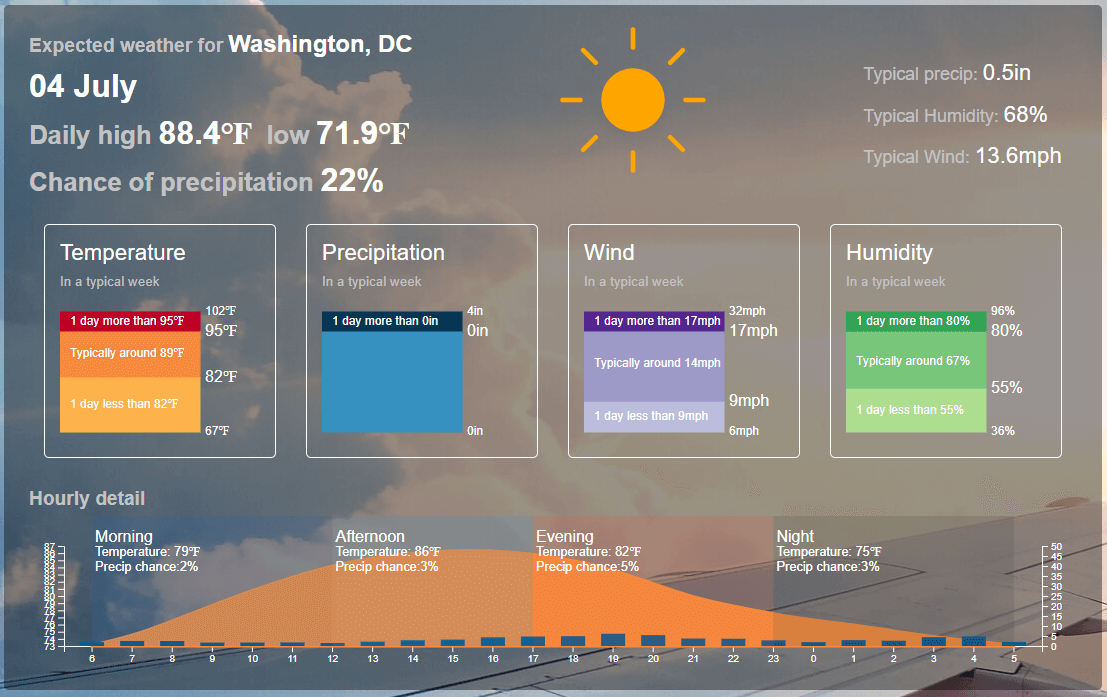
What statistical weather information do we want to know?
When creating statistical weather data-based forecasts, we need to find a the typical weather conditions for that location. For example, we would like to know the average high temperature, average low temperature and how likely it is to rain.
However this does not give us the full picture. If I am planning a possible vacation I need to know not only the normal weather but also the worst and best weather I might expect. If I am I am planning an outdoor event such as wedding, what is the likelihood that it might rain? And how much rain?
Knowing the historical weather ‘normals’ is interesting but we need to know how likely is it that the weather is significantly warmer or cooler than the average? We need to understand the complete picture – what is the normal weather, what is the worst weather possible and what is the best weather possible? And how likely is it that the more extreme weather might happen?
if we compare two locations, we can see how this might affect our planning. Here is the predication for July 4th in Honolulu, HI
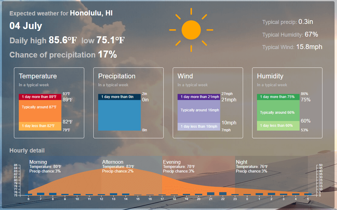
Notice how the normal Daily High is very similar to that of Washington, DC. However Washington, DC is much more variable – with possible swings in temperature from 67F to 102F whereas Honolulu swings in the fairly small range of 79F to 93F. The wide orange band of the typical weather (5 days out of the week) illustrates this by it’s larger size for Honolulu compared to Washington, DC.
Constructing the historical summary request
Now we have seen the possibilities of this kind of statistical weather request, we can construct these kind of queries ourselves. We will be using Weather Data Services to construct the requests. If you are not familiar with using Weather Data Services or have not set up an account, please see our Getting Started With Weather Data Services article.
In order to use the historical summary editor as in the definition below you will need to access the legacy web interface by clicking the “Legacy Version” link on the query builder page as in the screenshot below:

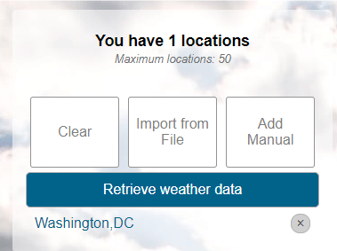
We have added Washington, DC to our list of locations:
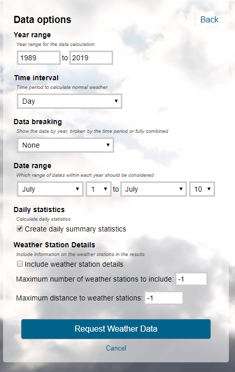
We will now create a Historical Summary request. For more on Historical Summary requests, please see the How to create annual or monthly climate summaries and normals for a location article. In this case we are going to focus on a daily summary. Here is the full set of parameters we set.
Year range: last 30 years (the default)
Time interval: Day
Data breaking: None – we don’t want to see individual days by day or year. We want all the data for the days in question to be summarized into a single row of data.
Date range: July 1st to July 10th.
Even though we most interested in July 4th, the weather on days around that date is going to be very similar so we add additional days so we have more data to analyze. For example, if it reached 102F on July 3rd vs July 4th, that is information we would like to know. By adding these extra days we are giving the calculation more information to work on so our result will be more representative of the weather that might happen.
Create Daily Summary Statistics: yes.
These statistics give us an even more rich picture of the weather on particular date.
Here’s the completed query:
The historical summary data set
The resulting data set is a rich set of information that can be used to understand the weather on a particular date.
Let’s focus on some of the key pieces of information. In this case, we’ve used Microsoft Excel to extract pieces of information that you are most interested in.
| Min | Mean | Max | |
| Maximum Temperature | 73.1 | 88.7 | 101.9 |
| Minimum Temperature | 55.5 | 70.9 | 82.1 |
| Precipitation | 0 | 0.1 | 2.2 |
These the daily statistics so for example the Maximum temperature ranges from 73.1 to 101.9F and the mean (or average) high temperature is 88.7F
Similarly the least it ever rains is 0″ but there has been up to 2.2″ in a single day in the date range in question. The average rainfall is often not as useful because a single high rainfall event will be averaged out to a small amount for each day. How often there is rainfall is just as important as how much rain falls on average.
Using distribution values to get a full picture of the likely rainfall
For even more detail on the likelihood of rain, the Precipitation distribution gives us a more complete picture. Here are the raw values. But what do these mean?
0.0,0.0,0.0,0.0,0.0,0.0,0.0,0.0,0.0,0.0,0.0,0.0,0.0,0.0,0.0,0.1,0.3,0.6,0.8,2.2
These values represent the probability distribution of the value occurring in a single day. There are 20 values so there is value represents a 5% probability. If we put them into a grid and chart, we can see this more clearly:
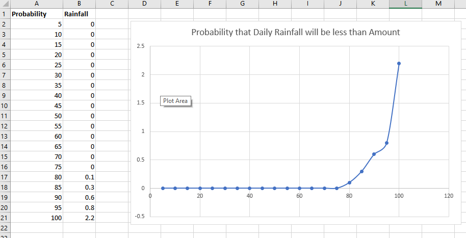
This shows that the data shows the probability will be less than amount. So for example, we can see that there is a 80% change that the amount of rain will be 0.1″ or less. So in a five day vacation, four of the five days are likely to be dry!
Using Microsoft Excel or other data analysis technique we can drill into this data to understand exactly the likely hood of certain weather conditions occurring.
Here’s a similar chart showing the probability that the Daily High Temperature will be less than a certain temperature:
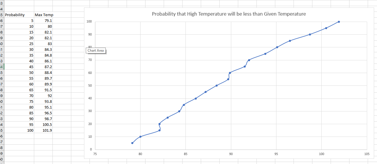
Again we can see that the temperature is less than 88F about 50% of the time (which is excellent because that matches the average daily high!)
More reading
This article introduces some of the more sophisticated features of the historical summary reports available through the Visual Crossing Weather Data platform. You can integrate these queries into your own applications and databases via the Weather API.
